Liberty
The approach
Working on the project from end to end, I led the research and design from initial discovery to final product delivery whilst mentoring a junior designer. We tested ideas on a six-weekly cadence and worked using AGILE methodologies.
The team
1x product designer, 1x UI designer 1x product manager, 1x frontend developer, 1x backend developer
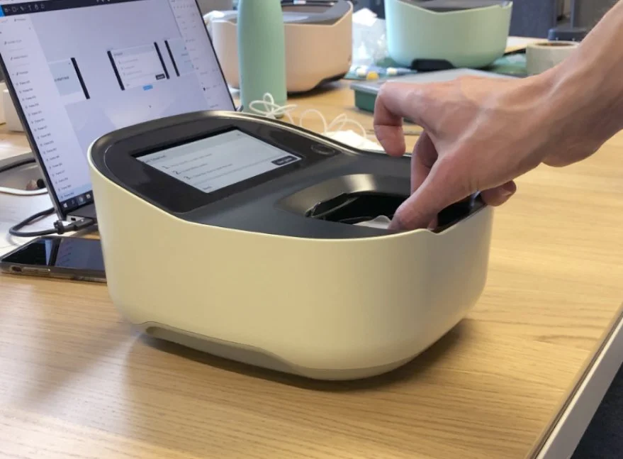
Liberty is a cloud-connected blood analyser that allows oncology patients to perform blood tests from home.
Comprised of a device, dashboard, and training service, I have been privileged enough to work on every aspect of this project from its early conception. This case study focuses on result-reporting software.
The brief
The brief was to develop a dashboard for oncologists, nurses, and other hospital stakeholders to view a patient’s blood hematological test results.
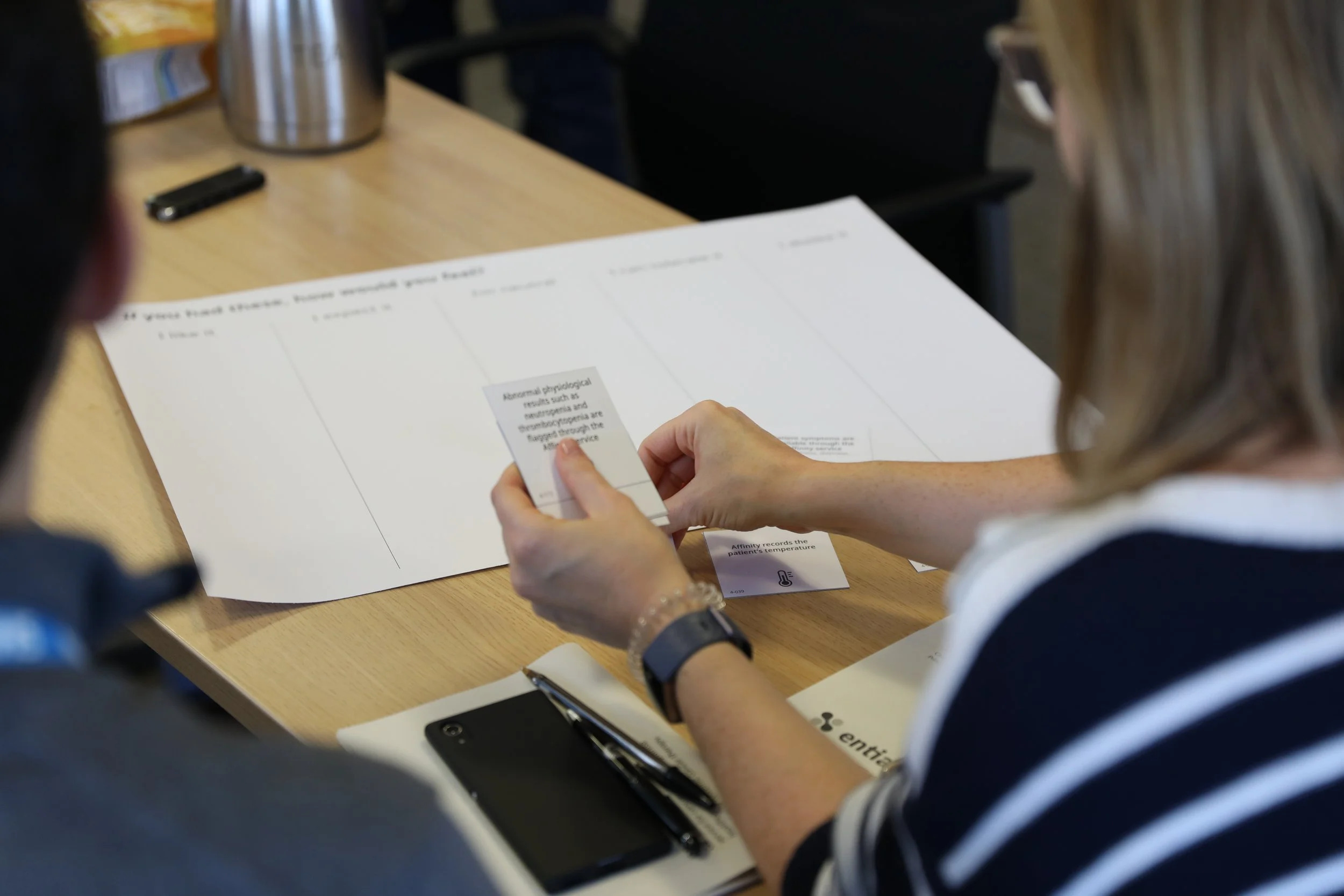
To start the project, we went through a discovery process that involved research activities ranging from shadowing healthcare professionals in the hospital to then having one-on-one interviews in person and remotely.
Discovery
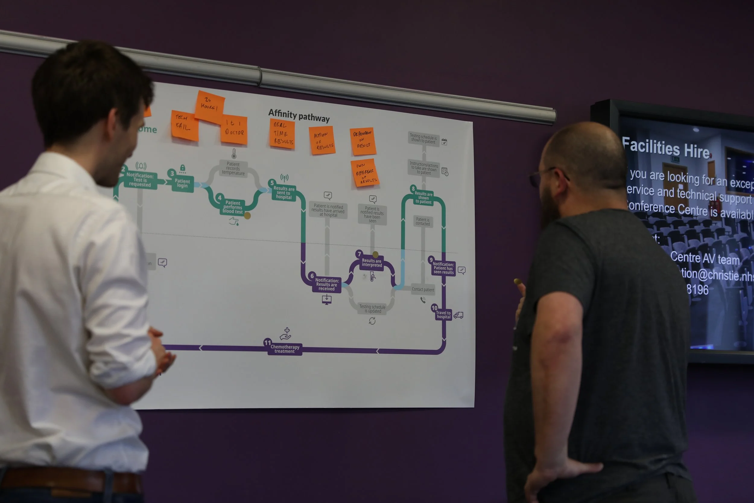

Pathway Mapping
One of the outcomes of the HCP interviews was a journey map demonstrating the patient journey along a treatment cycle. It allowed the team to understand what context our product would be used in.
View the full pathway here

Device Development + Remote Testing
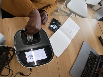


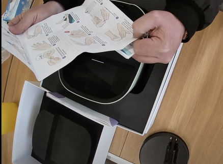
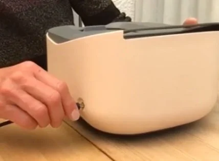
Device User Testing
Working with the Industrial team. Throughout the project I helped develop user testing with non-working prototypes to gain valuable feedback throughout the development cycle.
Dashboard Development

Story mapping
Using the journeys we initially developed, we created a step-by-step story map to help us understand our MVP product for the dashboard.
Initial Concept Development
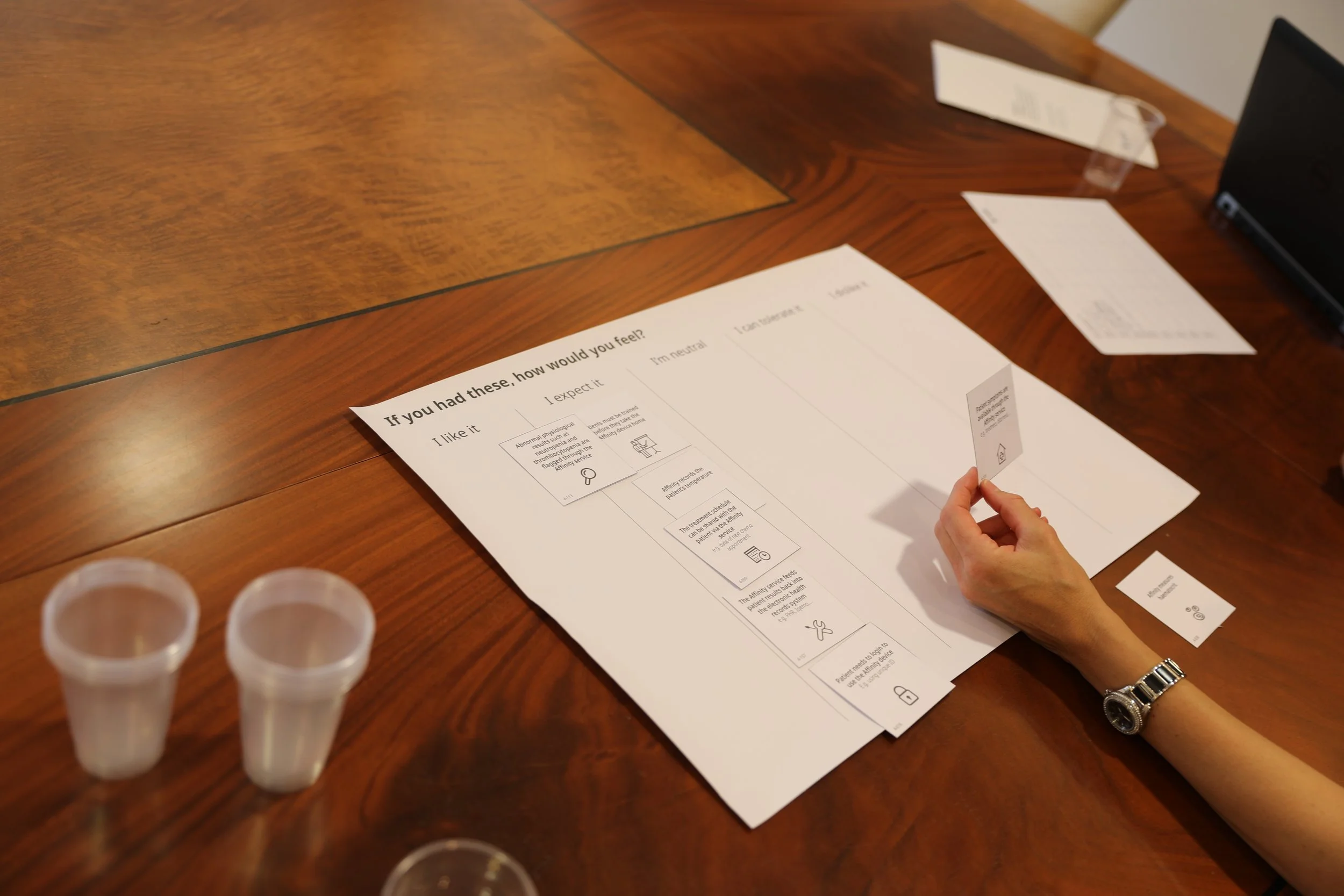
Working in two weeks sprints, we started to develop some initial low-fidelity designs for internal and external review. These initial designs were presented to HCPs as part of remote focus groups facilitated via zoom; it helped to develop early direction and test initial assumptions.

“Patient info without result info doesn’t work for me. I want to see results in as few steps as possible'“Oncology ‘H.C’
Further Development
We learned from testing that Oncologists preferred concepts that had a combination of results and patient information for efficiency.
We then developed a more structured prototype in Figma. Testing two concepts where results were available with patient names.

Testing Insights
Colour should be used sparingly and have a purpose that aids the use of the dashboard. Too much distracts the user.
HCPs prefer to designs that already feel familiar to them as they already have mental models around how EPRs work.
Copy needs to be sensitive around the language used when communicating a patient status, e.g., 'deactivated' sounds inappropriate.
Finding the correct information density is essential when displaying results. Therefore, there needs to be a mixture of white space to aid clarity.
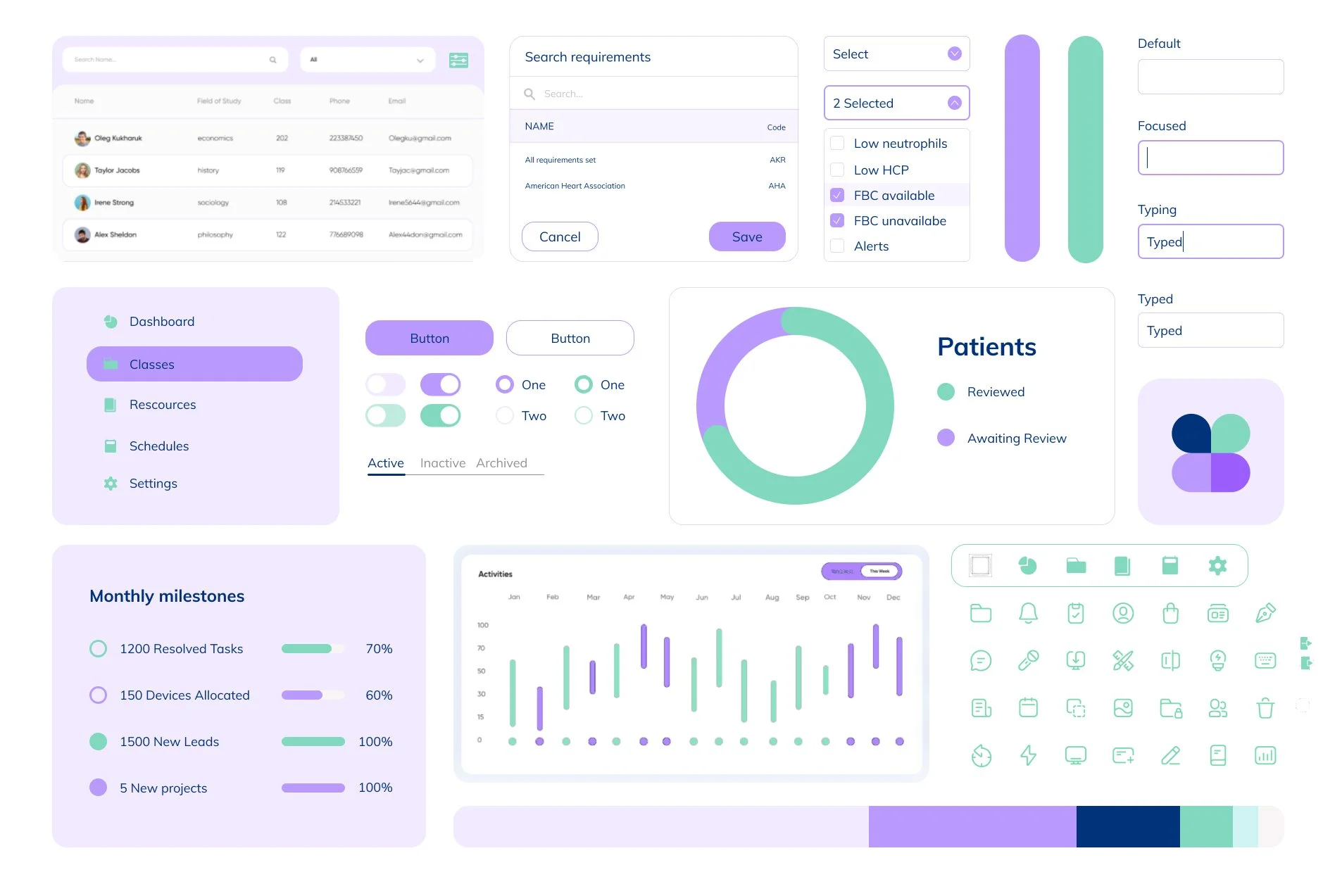
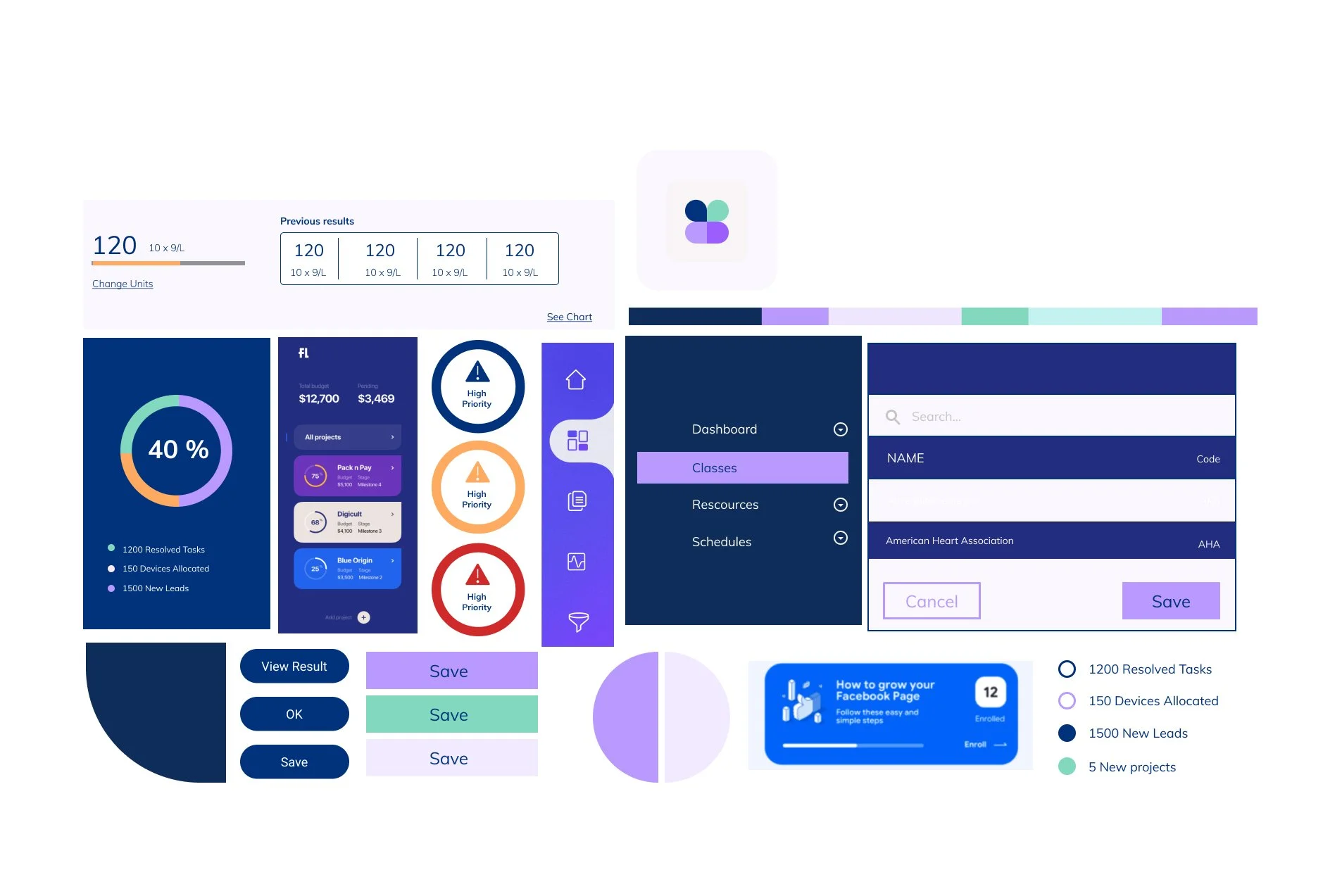
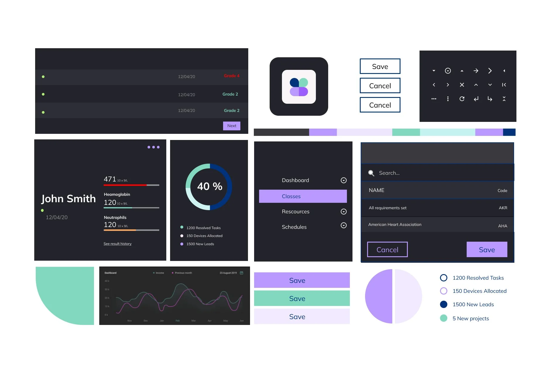
Visual development

Delivery
Working directly with the in-house engineering team, we set up an atomic design system that helped us align design and engineering.
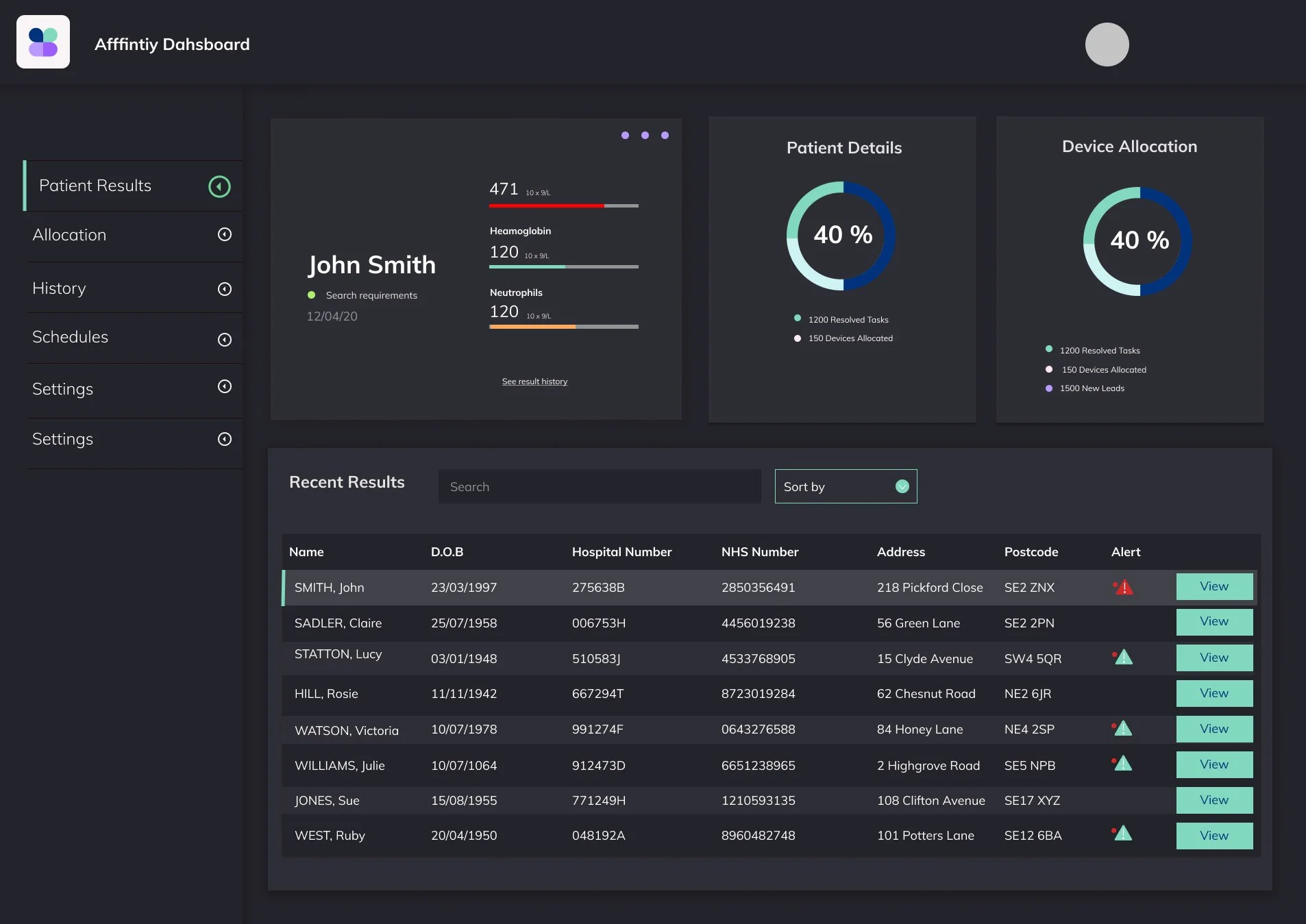
Reviewing Results
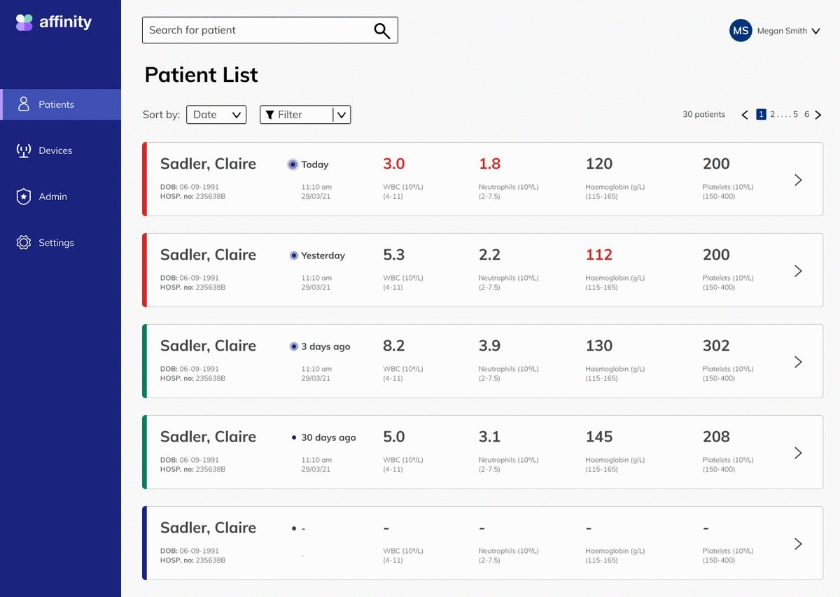
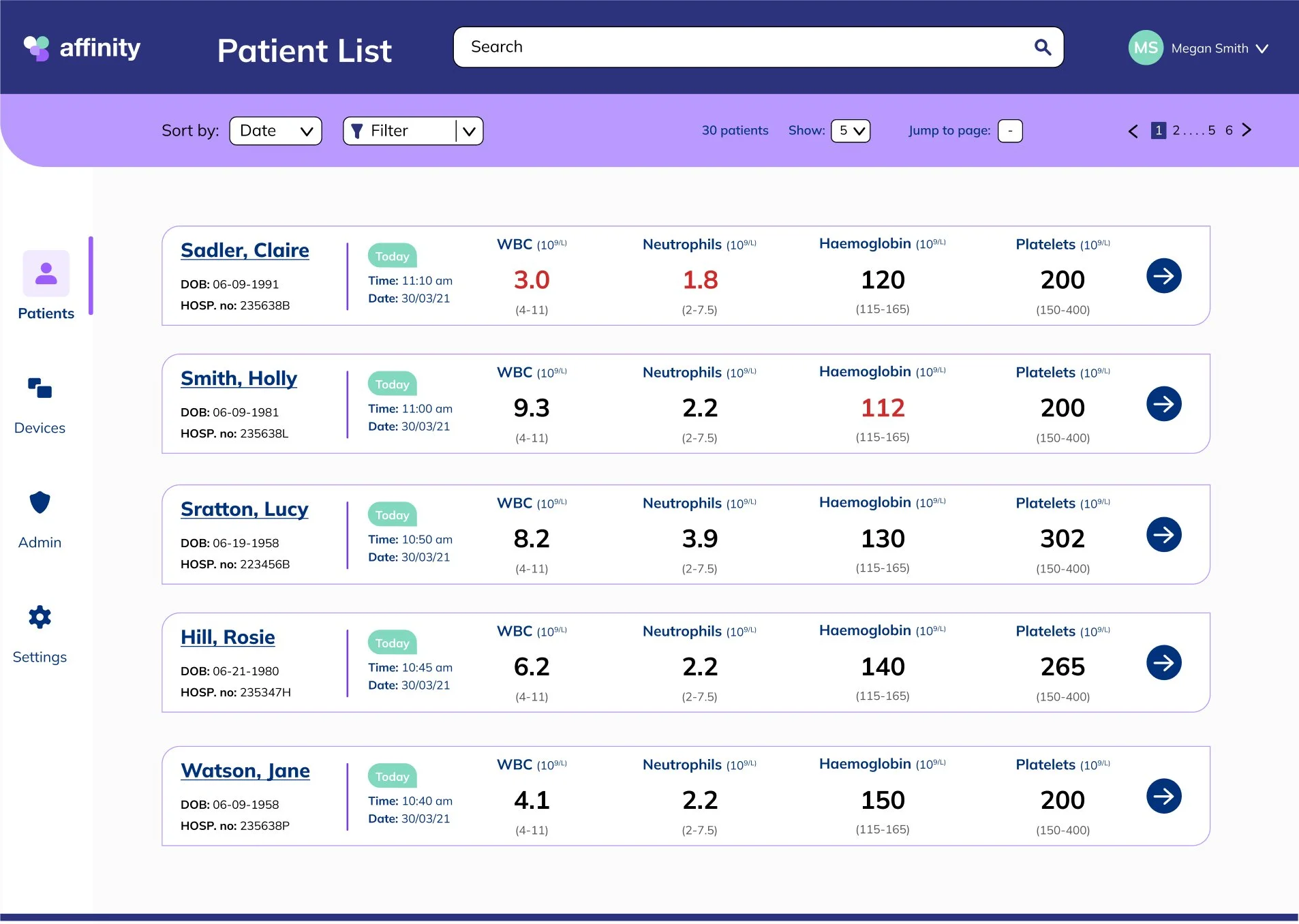
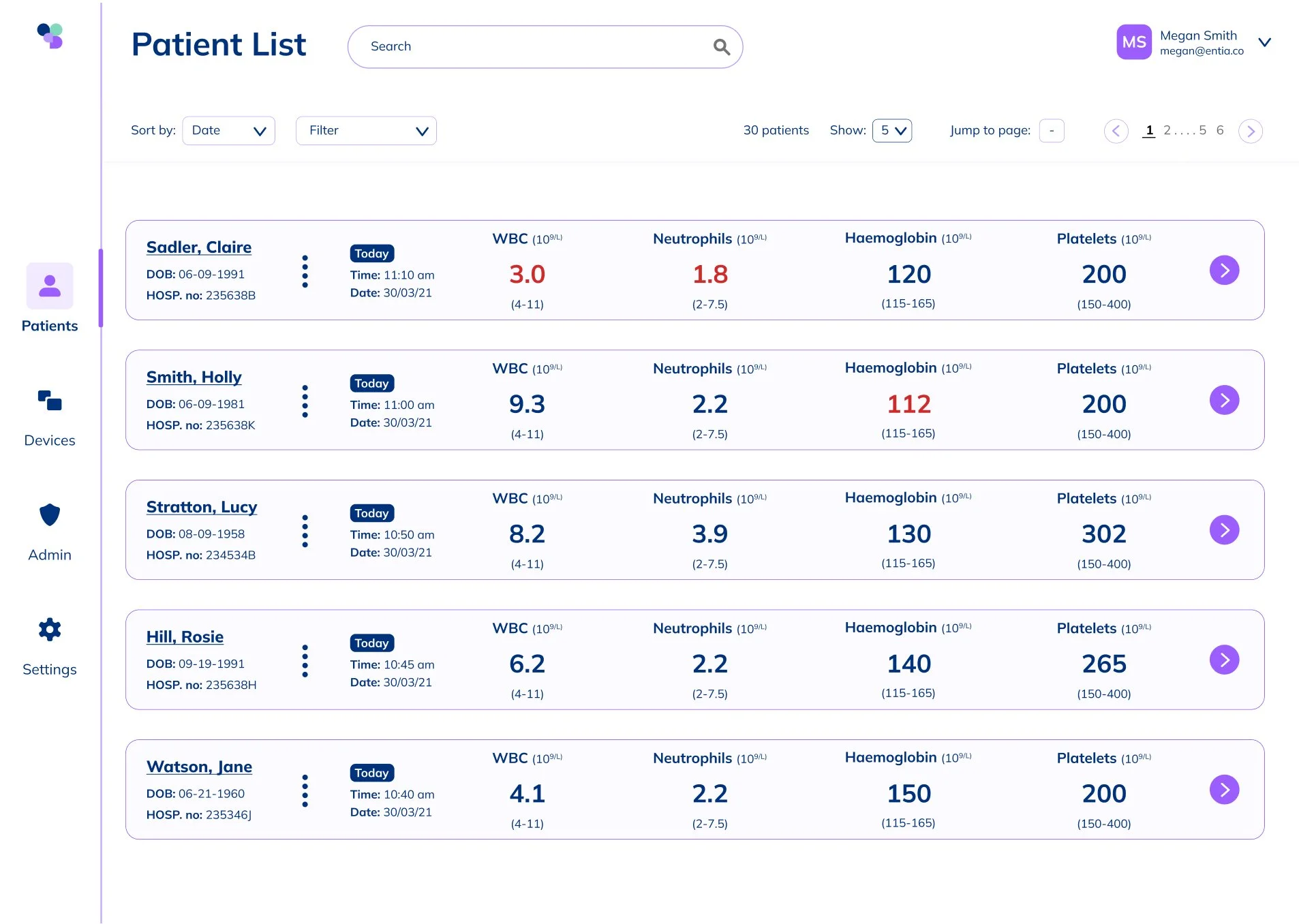
We settled on developing a card design to achieve the primary purpose of the dashboard, which was displaying a test result. Each card included three patient identifiers, the date of the test, the result, and warnings.
We learned from research that hospitals have a standardized range for healthy blood test results, so we implemented a color warning for out-of-range results and a chip that communicated how long ago the result was taken, as results were only relevant for 48 hours.

Reviewing A Patient’s page
The patient page displays a user’s essential information, result history, and device status. We learned from research if a patient had an unusual result, oncologists would want to understand the patient’s result history. After testing different ways to display them, we settled on a data table.
A user could also manually add a result if a patient had trouble connecting to the internet,

Issuing a device
The dashboard also allowed users to issue and withdraw devices from patients. Collaborating with our fulfillment team, we helped map what key information needed to be communicated to the person assigning the device. Once assigned, it would display when it was issued and if a patient had been remotely trained.
