
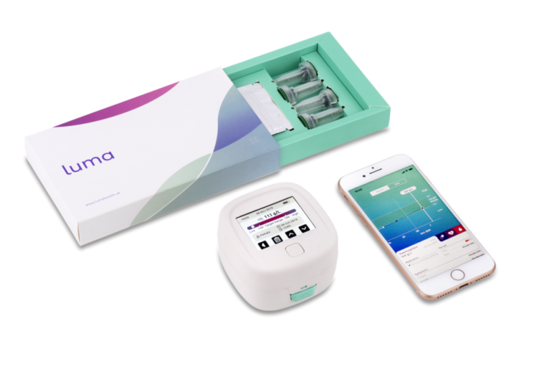
Creating the first of its kind home monitoring devices for people with iron deficiency anaemia
Luma is a medical device that measures and tracks haemoglobin levels from a single drop of blood.
My Role
Led UX across device + app
Developed the design system
Shaped core product features
Team
2 × Product Designers
1 × Product Manager
Offshore Engineering Team

The Challenge
Anaemia requires regular haemoglobin monitoring, yet traditional testing depends on in-clinic visits—creating friction, delays, and anxiety for patients.
Entia set out to design Luma, a home testing solution that allows users to take a reading from a single drop of blood and track their results over time.
The challenge was not just the device, but creating a trusted, end-to-end ecosystem across: Physical device, Mobile app, packaging, and brand.
Product Experience & Strategy
From this, we defined three core pillars:
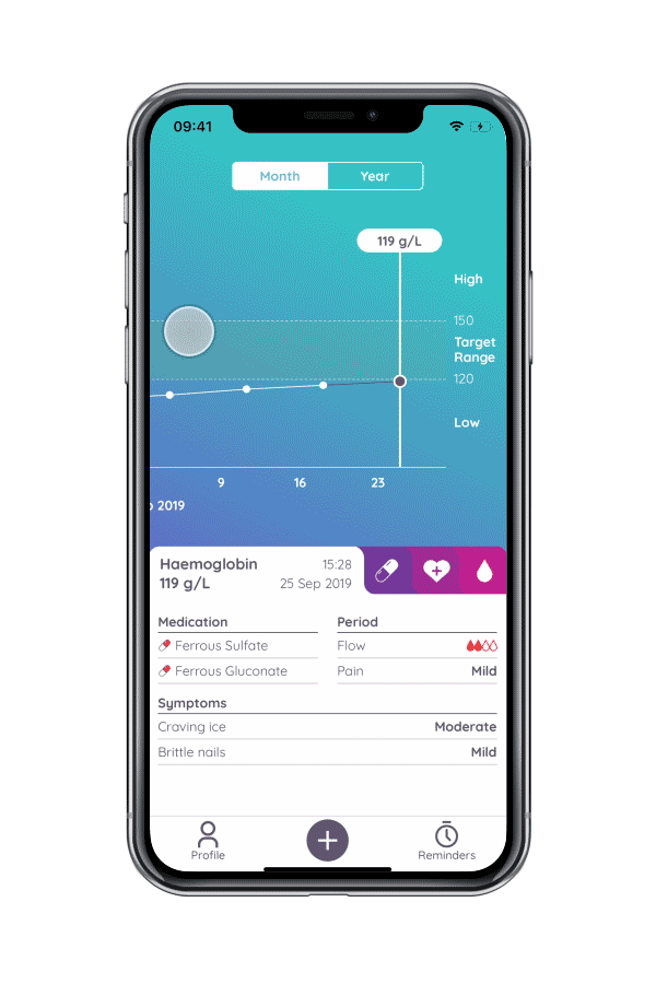
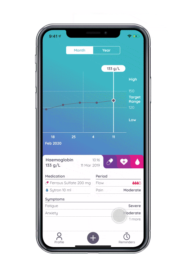
Results tracking: Understanding haemoglobin over time
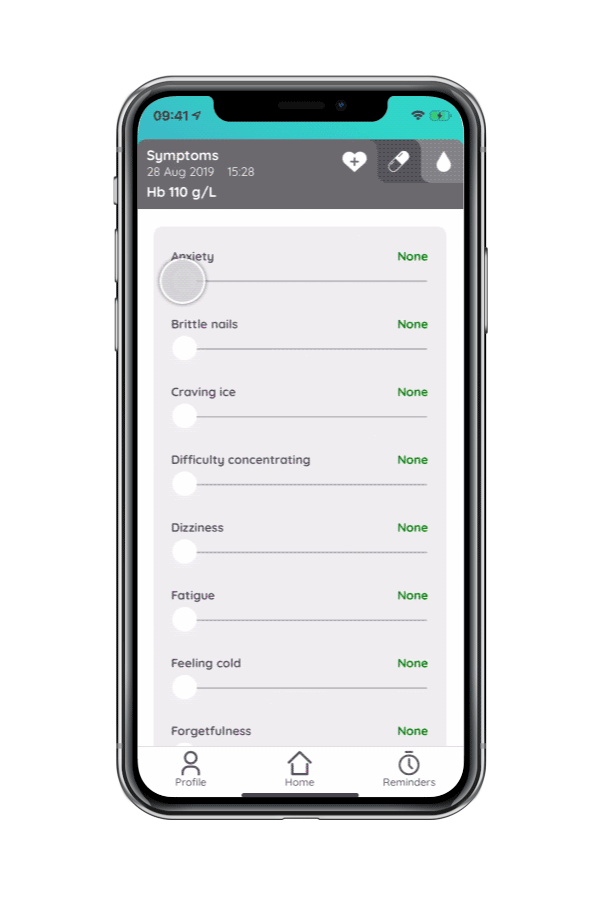
Symptom tracking: Connecting how users feel to their data
Medication & period tracking: Providing full health context
This ensured the product supported decision-making, not just data capture. A key complexity was designing across multiple touchpoints, the blood sampling process, Device interaction Mobile app experience

Approach & Discovery
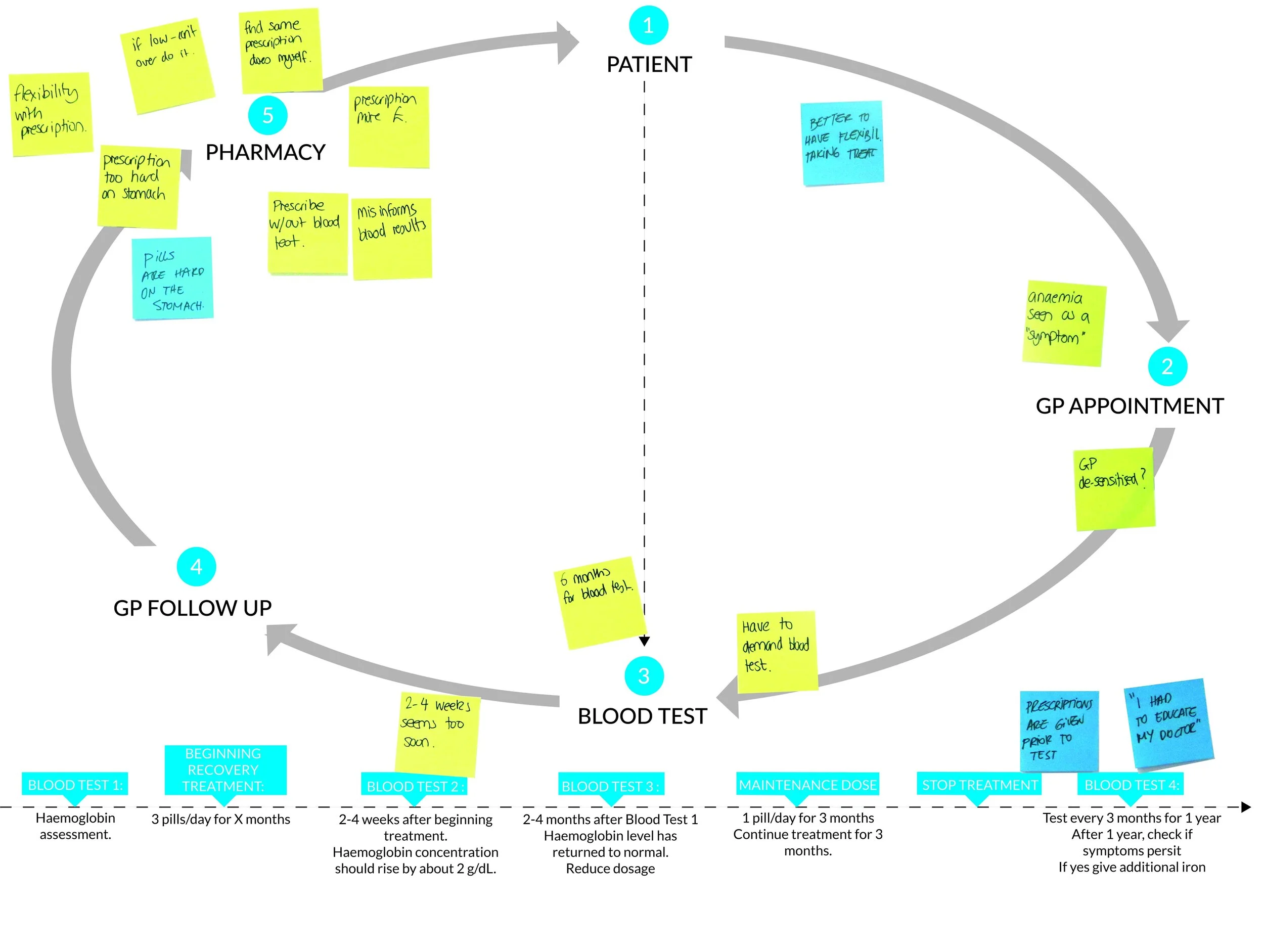
Given this was a new product category, we prioritised de-risking the core behaviour early. We focused on defining and validating the minimum viable experience: Test > Understand > Repeat. We ran continuous research cycles with people living with anaemia, using co-creation methods to uncover both functional and emotional needs.
This revealed a critical insight. ‘Users didn’t just need results—they needed context to make sense of them.’ This reframed the product from a “testing tool” to a health tracking system.
Key Challenges
Enabling confidence in a clinical task: Users were performing a blood test independently. We designed guidance to feel supportive and human, rather than technical or instructional.
Making data meaningful: A single reading has limited value. We introduced longitudinal views (monthly/yearly) to help users understand trends over time.
Designing for behaviour, not just usability: Adoption depended on repeated use. We optimised for:Low friction, Emotional comfort, Habit formation

Initial Design Concepts
Design Development
After establishing the direction of our initial features, we started to map out a comprehensive experience that showcased all the user steps.

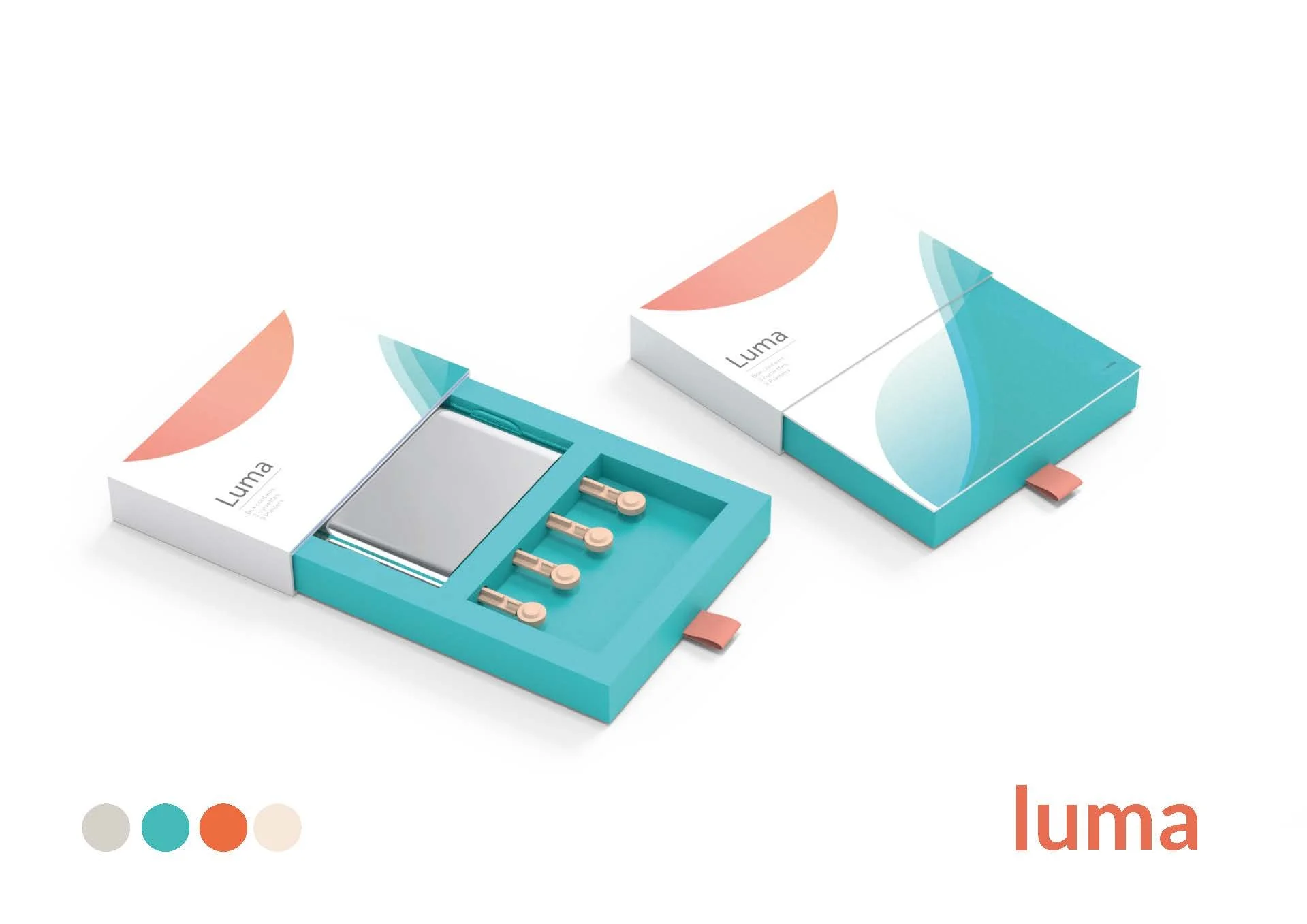
Brand & Packaging
Shifting perception from medical to everyday. Trust wasn’t just built in the UI—it extended to the entire product experience. Through concept testing, we identified that traditional “medical” aesthetics created resistance. We repositioned the brand toward. Softer, more approachable forms, Lifestyle-oriented visual language and Reduced clinical tone.
“I don’t want to be reminded I’m ill every time I pick the box up.”
This was a key moment in aligning the brand with user psychology.


Photography + Art direction
Developing a strong tone of voice and photography was key to brand development. We developed lifestyle photography to show users in their everyday environment, showing social situations with family, and reflecting them using the product. This was developed in conjunction with a media agency.

Final Outcomes
We delivered a cohesive, end-to-end product experience that enabled safe and repeatable home testing.Defined the core UX architecture across device and app, established scalable design foundations for future features, Enabled users to track and understand their condition over time. We also identified that trend-based visualisations (monthly/yearly views) were significantly more valuable than single data points—informing future product direction.
Uploading Results
Users would do a test on the device and were asked to upload test results manually by scanning QR codes. We developed an on-screen tutorial overlayed on the camera view. This way, the user would have a guide on aligning the QR code with the phone camera.
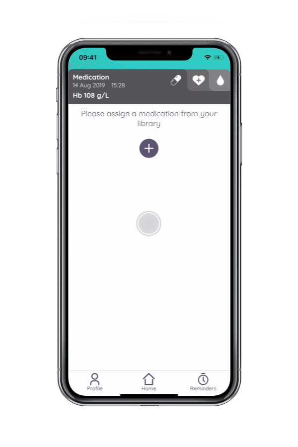
Medication Journal
The medication journal allowed users to create a new medication and specify strength, dosage, and frequency. These medications were recorded in a medication library that allowed the user to pick from a list of already created medications.
With low haemoglobin came a series of symptoms and side effects. Therefore, symptom tracking was also a crucial feature for users to track their improvement of health.
Symptoms Journal

Our research also highlighted that one reason women have low haemoglobin could be linked to heavy periods. Therefore, period tracking was included to help develop a round picture of all three factors influencing user anaemia.
Period Journal
Brand Video
Impact
Created a new category of home diagnostics experience validated by healthcare professionals
Reduced reliance on clinic-based testing for user and creating home testing service
Increased accessibility and frequency of monitoring
Supported more informed patient self-management with 95% approval rating.
Reflection
This project reinforced that designing in healthcare is not just about usability—it’s about trust, behaviour, and emotional experience.
By focusing on:
Systems thinking over isolated features
Context over raw data
Confidence over efficiency
We were able to translate a clinical process into something people could realistically integrate into their daily lives.